


Online DP-500 Test Brain Dump Question and Test Engine
Real Microsoft DP-500 Exam Dumps with Correct 164 Questions and Answers
NEW QUESTION # 65
You need to configure a source control solution for Azure Synapse Analytics. The solution must meet the following requirements:
* Code must always be merged to the main branch before being published, and the main branch must be used for publishing resource
* The workspace templates must be stored in the publish branch.
* A branch named dev123 will be created to support the development of a new feature.
What should you do? To answer, select the appropriate options in the answer area.
NOTE: Each correct selection is worth one point.
Answer:
Explanation:
Explanation
Box 1: main
Code must always be merged to the main branch before being published, and the main branch must be used for publishing resources.
Collaboration branch - Your Azure Repos collaboration branch that is used for publishing. By default, its master. Change this setting in case you want to publish resources from another branch. You can select existing branches or create new.
Each Git repository that's associated with a Synapse Studio has a collaboration branch. (main or master is the default collaboration branch).
Box 2: workspace_publish
A branch named dev123 will be created to support the development of a new feature.
The workspace templates must be stored in the publish branch.
Creating feature branches
Users can also create feature branches by clicking + New Branch in the branch dropdown.
By default, Synapse Studio generates the workspace templates and saves them into a branch called workspace_publish. To configure a custom publish branch, add a publish_config.json file to the root folder in the collaboration branch.
Reference: https://docs.microsoft.com/en-us/azure/synapse-analytics/cicd/source-control
NEW QUESTION # 66
You are using an Azure Synapse notebook to create a Python visual.
You run the following code cell to import a dataset named Iris.
A sample of the data is shown in the following table.
You need to create the visual shown in the exhibit. (Click the Exhibit tab.)
How should you complete the Python code? To answer, select the appropriate options in the answer area.
NOTE: Each correct selection is worth one point.
Answer:
Explanation:
Explanation
Box 1: pairplot
A pairs plot allows us to see both distribution of single variables and relationships between two variables. Pair plots are a great method to identify trends for follow-up analysis and, fortunately, are easily implemented in Python!
Example, let's plot data using pairplot:
From the picture below, we can observe the variations in each plot. The plots are in matrix format where the row name represents x axis and column name represents the y axis. The main-diagonal subplots are the univariate histograms (distributions) for each attribute.
A picture containing diagram Description automatically generated
Box 2: sepal_width
sepal_width is displayed with a height of 2.5 (between 2.0 and 4.5).
Reference: https://medium.com/analytics-vidhya/pairplot-visualization-16325cd725e6
NEW QUESTION # 67
You manage a dataset that contains the two data sources as shown in the following table.
When you attempt to refresh the dataset in powerbi.com, you receive the following error message: "[Unable to combine data] Add Columns is accessing data sources that have privacy levels which cannot be used together. Please rebuild this data combination." You discover that the dataset contains queries that fold data from the SharePoint folder to the Azure SQL database.
You need to resolve the error. The solution must provide the highest privacy possible.
Which privacy level should you select for each data source? To answer, select the appropriate options in the answer area.
NOTE: Each correct selection is worth one point.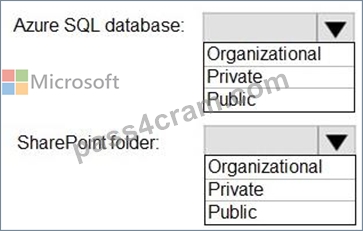
Answer:
Explanation:
NEW QUESTION # 68
Note: This question is part of a series of questions that present the same scenario. Each question in the series contains a unique solution that might meet the stated goals. Some question sets might have more than one correct solution, while others might not have a correct solution.
After you answer a question in this section, you will NOT be able to return to it. As a result, these questions will not appear in the review screen.
You have the Power BI data model shown in the exhibit (Click the Exhibit tab.)
Users indicate that when they build reports from the data model, the reports take a long time to load.
You need to recommend a solution to reduce the load times of the reports.
Solution: You recommend denormalizing the data model.
Does this meet the goal?
- A. Yes
- B. No
Answer: A
Explanation:
Explanation
Denormalize For Performance.
Even though it might mean storing a bit of redundant data, schema denormalization can sometimes provide better query performance. The only question then becomes is the extra space used worth the performance benefit.
Reference: https://www.mssqltips.com/sqlservertutorial/3211/denormalize-for-performance/
NEW QUESTION # 69
You use an Apache Spark notebook in Azure Synapse Analytics to filter and transform data.
You need to review statistics for a DataFrame that includes:
The column name
The column type
The number of distinct values
Whether the column has missing values
Which function should you use?
- A. display(df)
- B. displayHTML()
- C. %%lsmagic
- D. %%configure
- E. display(df, summary=true)
Answer: E
Explanation:
Explanation
display(df) statistic details
You can use display(df, summary = true) to check the statistics summary of a given Apache Spark DataFrame that include the column name, column type, unique values, and missing values for each column. You can also select on specific column to see its minimum value, maximum value, mean value and standard deviation.
Reference: https://docs.microsoft.com/en-us/azure/synapse-analytics/spark/apache-spark-data-visualization
NEW QUESTION # 70
You plan to generate a line chart to visualize and compare the last six months of sales data for two departments. You need to increase the accessibility of the visual. What should you do?
- A. Move important information to a tooltip.
- B. Configure a unique marker for each series.
- C. Replace long text with abbreviations and acronyms.
- D. Configure a distinct color for each series.
Answer: D
Explanation:
Explanation
Themes, contrast and colorblind-friendly colors.
You should ensure that your reports have enough contrast between text and any background colors.
Certain color combinations are particularly difficult for users with color vision deficiencies to distinguish.
These include the following combinations:
green and red
green and brown
blue and purple
green and blue
light green and yellow
blue and grey
green and grey
green and black
Avoid using these colors together in a chart, or on the same report page.
Reference: https://docs.microsoft.com/en-us/power-bi/create-reports/desktop-accessibility-creating-reports
NEW QUESTION # 71
You are using a Python notebook in an Apache Spark pool in Azure Synapse Analytics.
You need to present the data distribution statistics from a DataFrame in a tabular view.
Which method should you invoke on the DataFrame?
- A. rollup
- B. summary
- C. freqlcems
- D. cov
Answer: D
Explanation:
pandas.DataFrame.corr computes pairwise correlation of columns, excluding NA/null values.
Incorrect:
* freqItems
pyspark.sql.DataFrame.freqItems
Finding frequent items for columns, possibly with false positives. Using the frequent element count algorithm described in https://doi.org/10.1145/762471.762473, proposed by Karp, Schenker, and Papadimitriou.'
* summary is used for index.
* There is no panda method for rollup. Rollup would not be correct anyway.
NEW QUESTION # 72
You are configuring an aggregation table as shown in the following exhibit.
The detail table is named FactSales and the aggregation table is named FactSales(Agg).
You need to aggregate SalesAmount for each store.
Which type of summarization should you use for SalesAmount and StoreKey? To answer, select the
appropriate options in the answer area,
NOTE: Each correct selection is worth one point.
Answer:
Explanation:
NEW QUESTION # 73
You have an Azure Synapse Analytics serverless SQL pool and an Azure Data Lake Storage Gen2 account.
You need to query all the files in the 'csv/taxi/' folder and all its subfolders. All the files are in CSV format and have a header row.
How should you complete the query? To answer, select the appropriate options in the answer area.
NOTE: Each correct selection is worth one point.
Answer:
Explanation: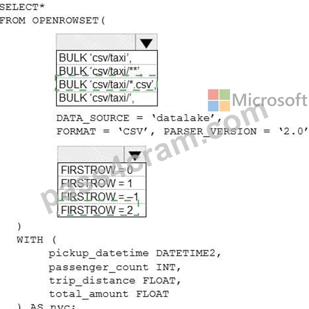
Explanation
Box 1: BULK 'csv/taxi*.CSV',
*.CSV to get all the CSV files.
Box 2: FIRSTROW=2
As there is a header we should read from the second line.
Note: FIRSTROW = 'first_row'
Specifies the number of the first row to load. The default is 1 and indicates the first row in the specified data file. The row numbers are determined by counting the row terminators. FIRSTROW is 1-based.
Incorrect:
Not FIRSTROW=1. FIRSTROW=1 is used when there is no header.
Reference: https://docs.microsoft.com/en-us/azure/synapse-analytics/sql/develop-openrowset
NEW QUESTION # 74
You have an Azure subscription that contains an Azure Synapse Analytics workspace. You create an Azure Data Lake and upload a CSV file named Filel.csv. You need to use Synapse Studio to query the data in Filel.csv by using a serverless SQL pool. Which Transact-SQL operator should you include in the query?
- A. OPENOUERY
- B. OPEMDATASOURCE
- C. STRIMO_SPLIT
- D. OPCNROWSET
Answer: D
NEW QUESTION # 75
You need to create Power BI reports that will display data based on the customers' subscription level.
Which three actions should you perform in sequence? To answer, move the appropriate actions from the list of actions to the answer area and arrange them in the correct order.
Answer:
Explanation:
1 - Create row-level security (RLS) roles
2 - Create a DAX expression.
3 - Add members to row-level security (RLS) roles
NEW QUESTION # 76
You have an Azure Synapse notebook.
You need to create the visual shown in the following exhibit.
How should you complete the code? To answer, select the appropriate options in the answer area.
NOTE: Each correct selection is worth one point.
Answer:
Explanation:
Explanation
Box 1: fill_between
atplotlib.pyplot.fill_between fills the area between two horizontal curves.
The curves are defined by the points (x, y1) and (x, y2). This creates one or multiple polygons describing the filled area.
Box 2: suptitle
Set the title of the visual.
suptitle adds a centred title to the figure.
Reference:
https://matplotlib.org/3.1.1/api/_as_gen/matplotlib.pyplot.fill_between.html#matplotlib.pyplot.fill_between
https://matplotlib.org/3.1.1/api/_as_gen/matplotlib.pyplot.suptitle.html#matplotlib.pyplot.suptitle
NEW QUESTION # 77
You have a Power Bl dataset that contains the following measures:
* Budget
* Actuals
* Forecast
You create a report that contains 10 visuals.
You need provide users with the ability to use a slicer to switch between the measures in two visuals only.
You create a dedicated measure named cg Measure switch.
How should you complete the DAX expression for the Actuals measure? To answer, drag the appropriate values to the targets. Each value may be used once, more than once, or not at all. You may need to drag the split bar between panes or scroll to view content.
NOTE: Each correct selection is worth one point.
Answer:
Explanation:
Reference:
https://docs.microsoft.com/en-us/dax/selectedvalue-function
NEW QUESTION # 78
You have a sales report as shown in the following exhibit.
The sales report has the following characteristics:
The measures are optimized.
The dataset uses import storage mode.
Data points, hierarchies, and fields cannot be removed or filtered from the report page.
From powerbi.com, users experience slow load times when viewing the report.
You need to reduce how long it takes for the report to load without affecting the data displayed in the report.
Which two actions should you perform? Each correct answer presents part of the solution.
NOTE: Each correct selection is worth one point.
- A. Replace the product category charts with a bar chart for sales and a hierarchy of Category and Sub Category on the axis.
- B. Change the report theme to monochromatic.
- C. Replace the single-value cards with a multi-row card.
- D. Replace all the filters on the Filters pane with visual slicers on the report page.
Answer: A,C
NEW QUESTION # 79
You are using DAX Studio to query an XMLA endpoint.
How should you complete the DAX expression? To answer, drag the appropriate values to the targets. Each value may be used once, more than once. may need to drag the split bar between panes or scroll to view content.
NOTE: Each correct selection is worth one point.
Answer:
Explanation:
Explanation
Box 1: CALCULATE
Box 2: CURRENTGROUP
CURRENTGROUP returns a set of rows from the table argument of a GROUPBY expression that belong to the current row of the GROUPBY result.
Remarks
This function can only be used within a GROUPBY expression.
This function takes no arguments and is only supported as the first argument to one of the following aggregation functions: AVERAGEX, COUNTAX, COUNTX, GEOMEANX, MAXX, MINX, PRODUCTX, STDEVX.S, STDEVX.P, SUMX, VARX.S, VARX.P.
Note: COUNTX counts the number of rows that contain a non-blank value or an expression that evaluates to a non-blank value, when evaluating an expression over a table.
Reference: https://docs.microsoft.com/en-us/dax/currentgroup-function-dax
NEW QUESTION # 80
You have the following code in an Azure Synapse notebook.
Use the drop-down menus to select the answer choice that completes each statement based on the information
presented in the code.
NOTE: Each correct selection is worth one point.
Answer:
Explanation:
NEW QUESTION # 81
Note: This question is part of a series of questions that present the same scenario. Each question in the series contains a unique solution that might meet the stated goals. Some question sets might have more than one correct solution, while others might not have a correct solution.
After you answer a question in this section, you will NOT be able to return to it. As a result, these questions will not appear in the review screen.
You have the Power Bl data model shown in the exhibit. (Click the Exhibit tab.)
Users indicate that when they build reports from the data model, the reports take a long time to load.
You need to recommend a solution to reduce the load times of the reports.
Solution: You recommend normalizing the data model.
Does this meet the goal?
- A. No
- B. Yes
Answer: A
Explanation:
Explanation
Instead denormalize For Performance.
Even though it might mean storing a bit of redundant data, schema denormalization can sometimes provide better query performance. The only question then becomes is the extra space used worth the performance benefit.
Reference: https://www.mssqltips.com/sqlservertutorial/3211/denormalize-for-performance/
NEW QUESTION # 82
......
Valid DP-500 Test Answers & Microsoft DP-500 Exam PDF: https://www.pass4cram.com/DP-500_free-download.html
Microsoft DP-500 Certification Real 2024 Mock Exam: https://drive.google.com/open?id=1a8TgJAqnG4w9QqvIq33dpsW0Pcgp6C8L